Standards and Their Shadows
Conversation accompanying the exhibitions Edition #5 and Epilogue at Haunt Berlin.
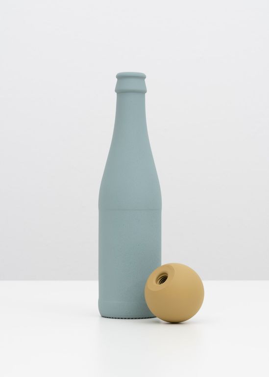
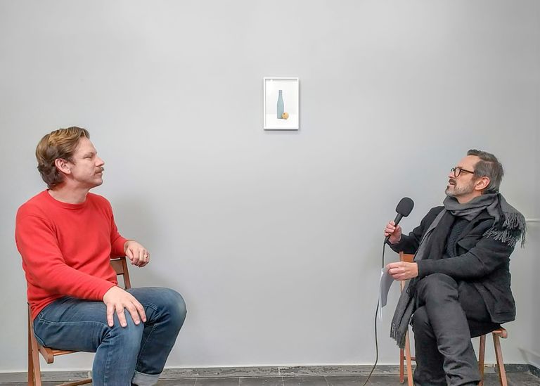
Harald F. Theiss: Welcome, Carsten Becker, to the exhibition at Frontviews at Haunt. Here we’ve organized two shows—a special edition and an accompanying exhibition. We’re sitting beneath a work titled Vichyform with Ball Knob. It’s a piece from your current series. You've been dealing with color and color catalogues for some time now. In a previous series—the color panels that also brought you recognition—we learn a lot about the historical context of these colors through their combinations. Could you tell us more about the background and your artistic approach?
Carsten Becker: In an earlier project, I was confronted with the RAL color system. RAL colors are standardized German industrial colors, and when working with any painter or coater, you have to speak in RAL numbers. I had always wondered: what are these colors, really? As I looked deeper, I discovered that they are standard colors used by government agencies, a collection of hues with a long history. Some of them are over 100 years old—there are colors dating back to the First and Second World Wars. When I read that, after WWII, some of these colors were removed—essentially deleted—that’s when my interest really began. In the RAL series, I tried to reconstruct these deleted colors with the help of specialists. I had them applied to aluminum panels and let myself be surprised by the result.
HT: Was there a specific intention from the start? It’s clearly about history and stories. I remember you shared fragments of your own personal history. For viewers, it’s fascinating to know how you combine these colors. Is there a particular order? Or is your approach strongly conceptual?
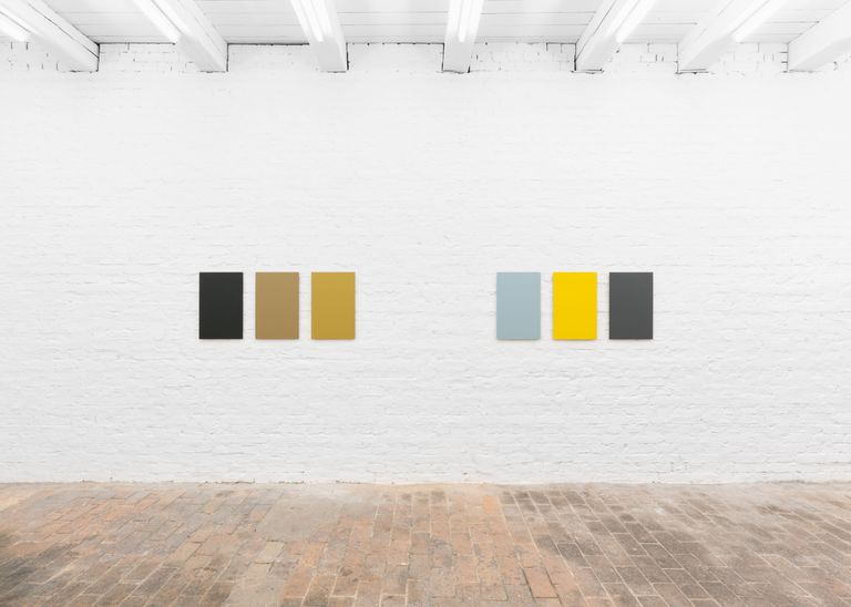
CB: My interest in the subject is also tied to my family history. I suspected I’d find colors that mirrored the color world of my grandparents—and I did. In 2018, I had a solo show at Frontviews where I presented various triptychs. Each triptych featured three related colors: three for trains, three for airplanes, three for tanks. That was my first attempt to create a thematic triptych around a specific application.
HT: It’s always intriguing to learn what function these colors originally served. Understanding that function also means understanding a piece of German history. I’ve led two or three guided tours with visitors, and what’s so compelling is that you use the color catalogue to open up an emotional path into difficult themes. Each color stands for something—some of them carry a heavy historical charge, don’t they?
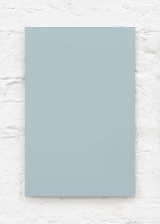
CB: In the edition I created for Frontviews, the round element—the ball knob—is painted in a color that was the first camouflage coating developed to evade infrared night vision in 1943. The blue, on the other hand, was used as camouflage for airplanes, to blend into the sky when seen from below. So each color had a function. Initially, in the RAL panels, I arranged them thematically. In the current series DIN, I’m trying to approach them more freely.
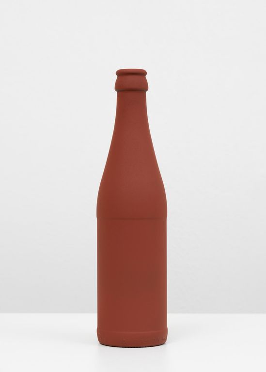
HT: I find the new work fascinating because you move from abstraction to objecthood, into an iconographically charged genre: the still life. But your still lifes don’t speak of transience—they speak of the past. The bottle and the sphere that we see here immediately evoke a speculative narrative. What’s the story behind these two objects?
CB: After working with the RAL color panels, I started looking for objects onto which I could apply these colors. These standard colors were, after all, intended for three-dimensional objects—cars, airplanes. The panels were like color swatches from a catalogue. Then I came across DIN objects. DIN is another German industrial standard, also over 100 years old, dating back to World War I. I thought it would be interesting to combine the color standard with standard objects, to create a hybrid of the two. At the moment, I’m working in such a way that each image features one painted object. For Frontviews, I combined objects for the first time.
HT: I find your approach to color particularly compelling, because it offers such a unique way of engaging with history. These still lifes feel contemporary; their combinations seem familiar, but the muted colors render them enigmatic. Is that sense of mystery important to you—in terms of how the work is received?
CB: For me, it really is a form of research—a large-scale investigation. Just as I discovered that some colors had been deleted and uncovered their historical functions, I’ve been amazed by the histories behind individual objects. For example, the bottle is called Vichyform. In a historical context, that’s a very charged name, as it recalls the Vichy regime—even though, in this case, it’s actually named after the mineral water from Vichy. That ambiguity is something I find fascinating. Jan-Philipp Frühsorge pointed out to me that in the final scene of Casablanca, after the Nazis are defeated, a character throws a bottle of Vichy water to the ground and kicks it away. So Vichy water appears in that exact historical moment. I come across stories like that and keep trying to play with them.
HT: One of the bottles—the first I ever saw from this series, which also hangs in the exhibition—features a reddish-brown color that you chose very deliberately, as it hints at something. If we stay curious, we learn that this color corresponds to the freight cars of the German Reichsbahn.
CB: That was around the time I first came across the term Vichyform. These are everyday objects—this particular bottle is still sold in supermarkets today. Just a few days ago, I found out that its first standardization occurred in 1942. I combined the iron oxide red from German freight cars with the bottle to create a deeply charged combination: a regime that collaborated with our ancestors and, at the same time, the larger theme of the Shoah—united in one image. For me, it’s a daring gesture. At first glance, there’s no hint of all that—but that’s how I imagine it.
HT: That’s exactly what I meant by the viewing experience. There’s this moment of unease—and that’s the strength of your work. Not just the still lifes, but the color panels as well. I also found it interesting that you decided to move from abstract forms to depict objects—specifically through photography. Why do you do that?
CB: For me, it’s a way of exploring the objects. Visually, they’re once again standardized in my images. I choose the perspective based on how the original DIN drawings present these objects—like technical floor plans drawn by engineers, showing cross-sections, measurements, and radii. I wanted to treat the visual language of the objects in the same way. I could present these objects as sculptures, but I want to show just this one perspective—harsh and technical. That’s also interesting in terms of color: these industrial paints change appearance depending on the light. In the morning sun, they look different than in the afternoon. But in the photograph—because I use controlled, technical lighting—there is only one hue, identical at all times of day. Again, it’s a form of standardization, a reduction—even in color.
HT: I already know you’re continuing to work on this series. We remain curious—it will be exciting to see what new compositions you come up with in the future. Thank you very much.