Forgotten Colors
Works Discussed
Trees in Poland, snow outside Stalingrad, the North African desert, they all have their individual colors. Their shades and hues do not change, probably not even over the course of decades or centuries, yet the collective memory of succeeding generations recalls the sites of World War II almost exclusively in black and white. When we are shown color images from the war, the effect is a peculiar one: They almost seem too real, as though something had been added to the document, the photograph, the film, like an illicit increase in realism. Often the perceived line between fiction and document runs precisely between color and greyscale. There are also those colors, however, that have been lost or forgotten. Camouflage colors, standardised colors, industrially produced varnishes. They appear and then disappear again. It would almost be possible to write a history of the twentieth century on the basis of colors and varnishes alone.
One of the great fears of modernity is the standardisation of all areas of life. At the same time, that fear is a promise: Everything is supposed to be reproducible everywhere, in consistent quality. Whenever utility objects are manufactured industrially, standards are a necessity. At the beginning of the twentieth century, such standards are established for the first time, and some of them still apply today. The Deutsche Industrie-Norm (DIN) has existed since 1918 — machine parts and paper formats were standardised for the first time. Initially, DIN was only a recommendation, since consistent design was meant to encourage competition.
This also applies to the colors used for varnishing, painting and dying utility products. In 1925 a joint initiative between government and private industry saw the establishment of the Reichsausschuss für Lieferbedingungen (Reich Committee for Delivery Conditions), shortened to RAL in accordance with the time’s fondness for abbreviations. Its members: the Association of German Paint Manufacturers, the Association of German Varnish Manufacturers, and the Association for Safeguarding the Interests of the German Chemical Industry.1 Here too, standardisation was a driving force: Two years later, the RAL would go on to define forty standard colors.
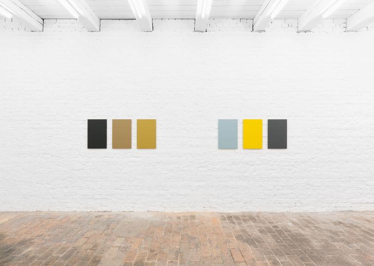
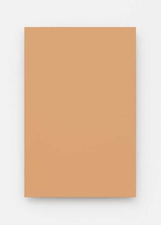
RAL is not a classification system like the Pantone Rainbow but a collection of colors still in use to this day. What fascinates Carsten Becker are the gaps in this collection: Few things have more to say than that which is concealed and lost. For instance, Becker uses panzer grey, sand grey and dark yellow to produce triptychs. His intensive working of the RAL colors also serves to reveal the subtle changes between seemingly identical hues.
In 1932, an updated version of the RAL color collection was published. The coloring standard applied to industry, the railroad and the military. Not only government bodies—such as the Reichsbahn, the German State Railroad—were among the subscribers to the color collection, but a political party as well: the NSDAP. That same year, 1932, the Organisationsbuch der NSDAP was published. The book reveals much about the Nazis' compulsive obsession with order. But it also describes their visual identity down to the smallest detail: how uniforms, insignia and flags were to look, where the weapon was to be carried, when which uniform was to be worn. That the Nazi party was among the users of the RAL color collection is all the less surprising given that the "basis of political work for Germany" was declared to be "the soldierly". Alongside colors for civilian purposes, camouflage colors soon made up a large part of the collection.2
The idea of uniformity was not a Nazi invention, but it meshed perfectly with fascist cultural policy. Literature, art, architecture and design were subjected to a völkisch ideal of form. An ideal somewhere between rural simplicity and soldierly discipline was invented by the Nazis and elevated to a guiding model. A first step was to subordinate the Deutscher Werkbund to the "Kampfbund für deutsche Kultur" (Combat League for German Culture).3 Gleichschaltung: all spheres of life were to be brought into line, private and public, industrial and cultural. The Kampfbund initiated antisemitic purges, saw to it that the Bauhaus was closed, and drove many designers and architects of modernism into exile.4 Under national socialist rule, norms became duty, and the shapes and hues of utility objects became political.
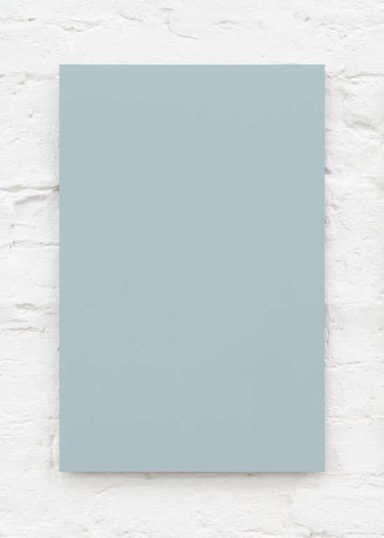
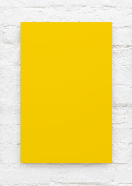
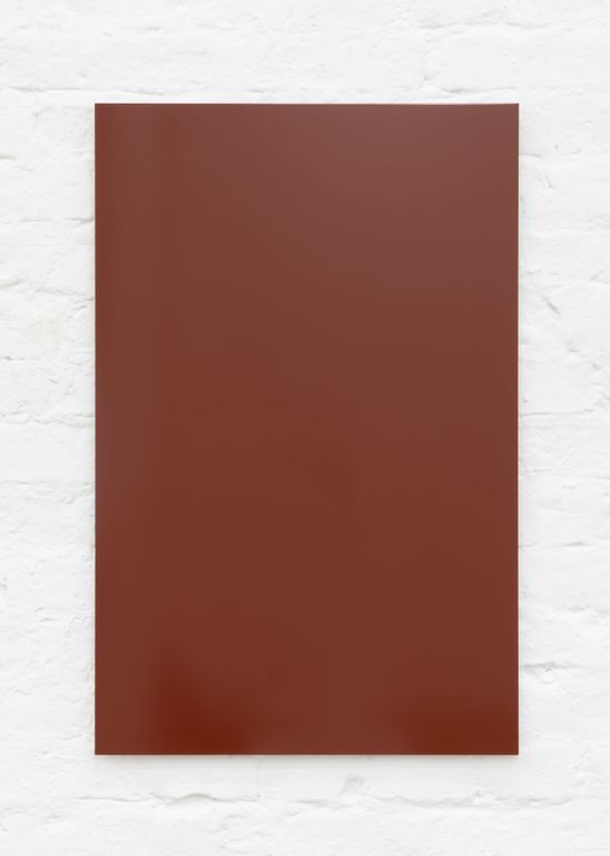
Becker’s triptychs tell a story, but in abstract fashion: They gather monochrome panels of RAL colors, most of which are thematically connected. The paint scheme of the Messerschmitt BF 109, for instance: light grey underneath, so as to be camouflaged against the sky, green grey on top to merge with the ground. The nose of the fighter jet is painted yellow—a striking color used to identify friend or foe. These three colors form a triptych. Or the three colors of the Reichsbahn: Violet for the luxury wagons, flame red for the wheels and red brown for the box wagons. RAL 8012, the varnish used on the box wagons in which people were transported to concentration camps, bears witness to the Shoah. A wagon of this kind can still be seen today at the holocaust memorial of Yad Vashem.
The history of RAL does not end with World War II. Many colors were renamed or simply taken out of the collection. First in 1953: RAL 8020, for instance, also known as sand yellow, brown or yellow brown, developed for the campaign of the Wehrmacht's Afrikakorps between May 1942 and May 1943. Then, in 1961, further removals, for example RAL 7028 — dark yellow. The color existed in three variants and was used for the heavy equipment of the Wehrmacht. The denazification of the post-war years was also to affect the symbolic world of color standards.
In 1955 the GDR established its own color standard. TGL, Technische Normen, Gütevorschriften und Lieferbedingungen (Technical Standards, Quality Specifications and Delivery Conditions), was what the specification was called in the other German republic from then on. The binding regulation remained in force until the standards union of 1990, although that term is misleading, since from then on RAL applied to the whole of the Federal Republic.
Many colors are embedded in cultural memory. The leading medium of television archives the early 1970s in color, for example the hunt for the RAF terrorists (Red Army Faction). When Andreas Baader is captured in Frankfurt in 1972, the police are wearing fir green uniforms. Succeeding generations know the police in mint green; from 2004 onwards, uniforms and vehicles change their color to traffic blue (RAL 5017).
The camouflage paints employed by the Bundeswehr (Federal Armed Forces) are called tar black, leather brown or bronze green. The colors bear names that recall a pre-industrial world. In the 1960s, the FeTAp 611 telephones of the Bundespost (Federal Post Office) are made from pebble grey ABS plastic. Since 1986, the Deutsche Post is colored in broom yellow. Only the name telemagenta, a permanent feature in the design of Telekom since 1992, belongs to the initial era of digital communication.
Colors for camouflage, for identification, for standardised design: Focusing on these alone, a story can be told about the corporate design of German Fascism. The history of the Federal Republic is accompanied by RAL colors. Like a microcosm, the color collection contains a miniature reflection of historical events.